I first came across the Interaction Design Foundation about 18 months ago when my father-in-law, a data analyst at a large accountancy firm, told me that he’d been enjoying some of their content and thought I might like it too. He was right – in my role as Quality Assurance Manager, users are at the centre of my team’s work and it’s routine across the whole company to be consistently learning and improving. I jumped straight in to the ‘Usability Expert’ learning path and haven’t looked back. I’m always looking for ways to upskill myself and my team – we don’t have the personnel for anyone to be too specialised in one area, so it’s important that we all have a range of skills. When I’d seen the value available I signed my team up too, and as we were just about to start building a couple of brand-new products the timing was perfect.
Since then, I’ve completed two full UX courses and am well on my way with a couple more – the self-paced approach means it’s easy to fit in around other work and professional development tasks, and there’s nothing that keeps me motivated better than a progress bar! The stats showing my rank within my country, continent and the world don’t hurt either, though there’s never any sense of competitiveness or ill feeling between the other community members. Each person gets the certifications they’ve earned, whether a pass, top 10% or coveted 100% certificate. It’s great to have access to a community of other UX enthusiasts – unlike some other sites I’ve seen, the discussion forums aren’t an afterthought but are an integral part of the Foundation. Learners are encouraged in each course to share and critique ideas, and there are even awards for taking part both online and (when we’re not in lockdown) face to face.

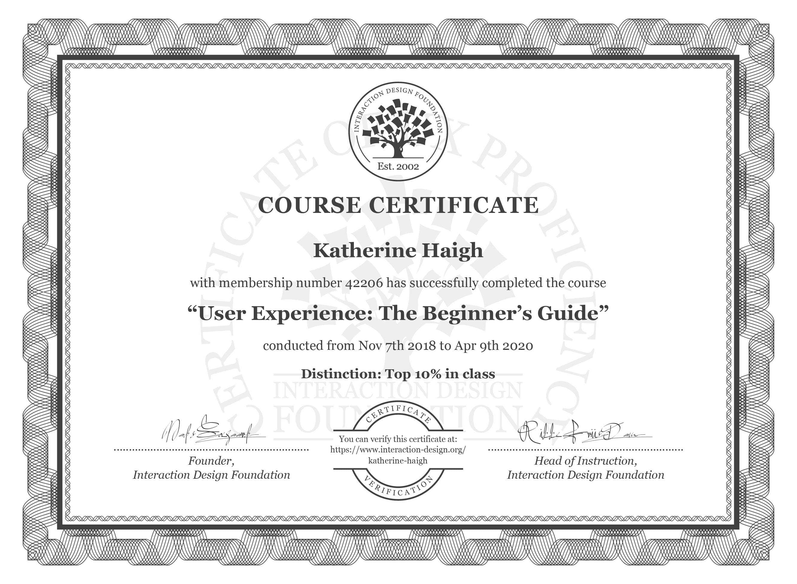
As for the content, some of it has affirmed things I was already aware of but didn’t know how to articulate. Before ‘User Experience: The Beginner’s Guide’, I could tell the Product Development team that I didn’t like something they’d designed, but not always what the problem was. Now, I can point to specific issues with specific resolutions, like too much content on one page of a website, or a disparity between icons in an application and tools or symbols associated with performing a similar task in the real world. I’ve learned about the importance of considering users’ emotions and the context they’re working in, as well as just what the product is supposed to do. I can contribute new insights to discussions about how to implement a client request and point to research which backs up my points. And, because I’ve got a certificate to show my qualifications, the team have got to listen!
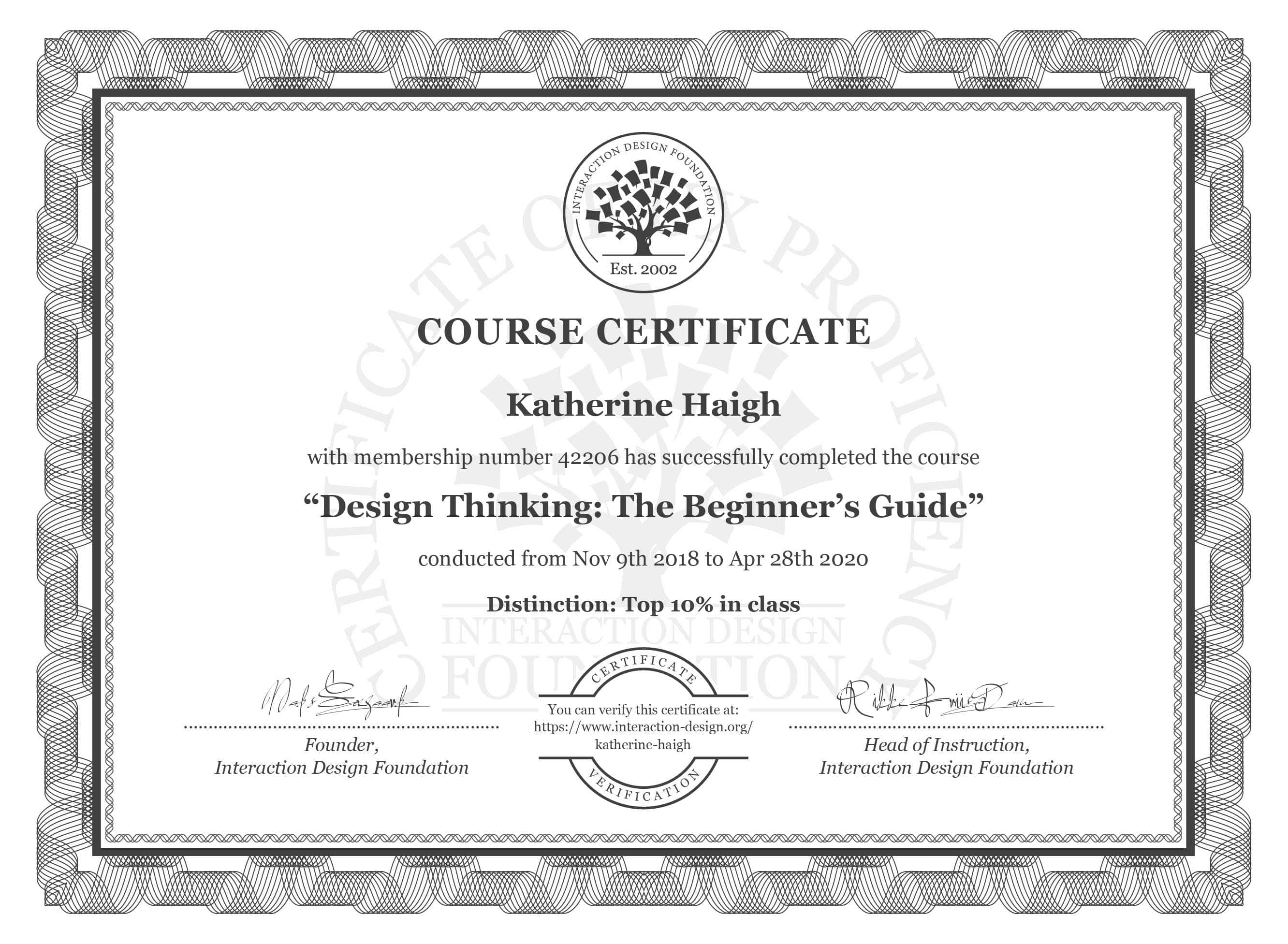
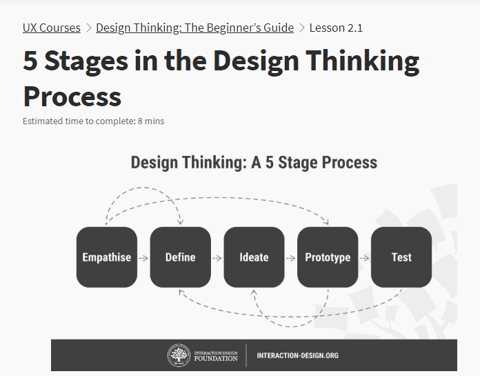
The other course I’ve completed so far is Design Thinking: The Beginner’s Guide. This hasn’t so much changed my perspective on the software I test as changed my entire worldview! The beauty of the Design Thinking process is that it doesn’t just apply to design, either of physical products or software. Anything being created for use by others can benefit from the approach, whether it’s a meeting agenda, a coffee machine or an ice cream kiosk. Candidates on BBC’s The Apprentice could spare themselves some of the serious errors which make for such great TV if they started off with a bit of empathy and ideation before plunging into the design phase. A clear benefit of ‘Empathise’ as a central tenet is that empathising with your users (as the process demands) usually leads to an increased level of empathy amongst the team as well, which can only help them to work together effectively.


Outside of the workplace, I’ve been amazed to see how widely applicable the Design Thinking process is. In my volunteer role with Girlguiding I often need to come up with new activity ideas for children and young people – anything from an owl-themed camp for ten teenagers to an activity day for hundreds of 5-10-year olds. When your ‘users’ are so clearly different from you it’s easy to see that you need to consider their point of view rather than your own, and that it takes effort to do this. A craft activity which is easy for me as an adult with fully developed hand-eye co-ordination might be at best frustrating and at worst impossible for a young child. Before learning about Design Thinking, I once planned what I thought would be a fun evening of games using balloons, only to discover that a number of my group had a balloon phobia and refused to play, which made their friends want to sit out too and turned the evening into a bit of a disaster, all because I hadn’t applied a sufficient level of empathy when I developed my plan.
Back in the office, my focus in Quality Assurance has always been to Test, which is the fifth (but not necessarily final) step in the Design Thinking process. The cyclical nature of the process ties in very neatly with our Agile development methodology, in particular the focus on continuous improvement. At CoreFiling, testing is anything but a final task stuck on the end of the development workflow. We test features, bug fixes and integration as we go along, and this feeds back immediately into the implementation of other features much like how the Test phase of the Design Thinking process feeds back immediately into the Define stage. The testing we do before a product release is confirmation of the quality we’ve built in via the feedback loops throughout the design and building process, which mirrors the high level of quality and suitability a Design Thinking approach brings to the final version of any product.
The courses don’t just explain the process or give examples of how it’s worked; they also introduce a huge range of methods so that even a novice can get stuck in to implementing the process straight away. The classics like brainstorming make an appearance but they come alongside dozens of others including ‘brainwalking’, empathy mapping, affinity diagrams and (my favourite) Worst Possible Idea. The process is so creative that the most serious end goal can give rise to some fun or even joyful sessions in the ‘Ideate’ and ‘Prototype’ stages. To a group of introverts like my colleagues, the high levels of interaction and the shift from individuals at computers to groups in an open space, armed only with sticky notes, could seem daunting, but the course demonstrates the effectiveness of these methods and encourages attendees to try them out on a small scale, and it’s got me convinced that sparking creativity in this way can only be a good thing.

As my certificates show, the courses are self-paced so you can take as long as you need to complete each one. You can sign on to as many as you like at once, and there’s no requirement to complete certain courses in order to ‘unlock’ others – once you’re a member, you have access to everything! When a course you’ve signed up for begins the lessons are released on a regular basis, but if like me you don’t have time to do each one as it becomes available that’s fine as they’re waiting for you when you do. And of course in these times of lockdown there’s no impact at all on the course delivery 😊 The lessons give you a time estimate at the top so you know how long each one will require, and they vary between reading, watching videos and coming up with your own ideas. Questions are either multiple choice (marked instantly) or free-text (marked within a couple of weeks). Once you’ve got a multiple choice question wrong, you can’t retry it but you are given the correct answer and reminded (maybe a little smugly, but the point is valid) that failure is the best way to learn.
My favourite thing about the IDF is that they live their ethos. On their platform you’re learning about UX from the best teachers, so it stands to reason that the teaching will be a great experience for you as a user of the platform, and it really is. Unlike some courses I’ve signed up for there are no pushy texts asking why you didn’t turn up to the lesson five minutes after it opened, and all of the video content is pre-recorded so you can play it back at your leisure. There’s no time limit on individual lessons and you can skip back and forth between them so if there’s a long question you want to spend time on later you can move on and return to it (and all the relevant content) later. When I was commuting I often worked through some of the shorter, bite-size lessons on my mobile phone during the bus journey. I’m not a Usability Expert just yet but I’ve learned so much already and I can’t wait to discover more.
